BOMBER SKI
Prioritizing mobile features in subzero
TL // DR
Bomber Ski is a luxury ski retail startup expanding into a full lifestyle brand. To support this evolution, they’re introducing exclusive membership events, concierge services, and fitness technologies. I worked with the CEO and a contracted development team to make this all accessible alongside their retail store through a premier mobile app.
ROLE
Product Design Lead
Trying to have it all
The CEO had big ambitions for the Bomber Ski app, from fitness tracking and community events to luxury trip booking and shopping. The challenge was figuring out what truly mattered most to users, whether they were on the mountain, in the lodge, or back home planning their next trip. This prioritization became the foundation for how we structured and visualized the experience.
Pioritization
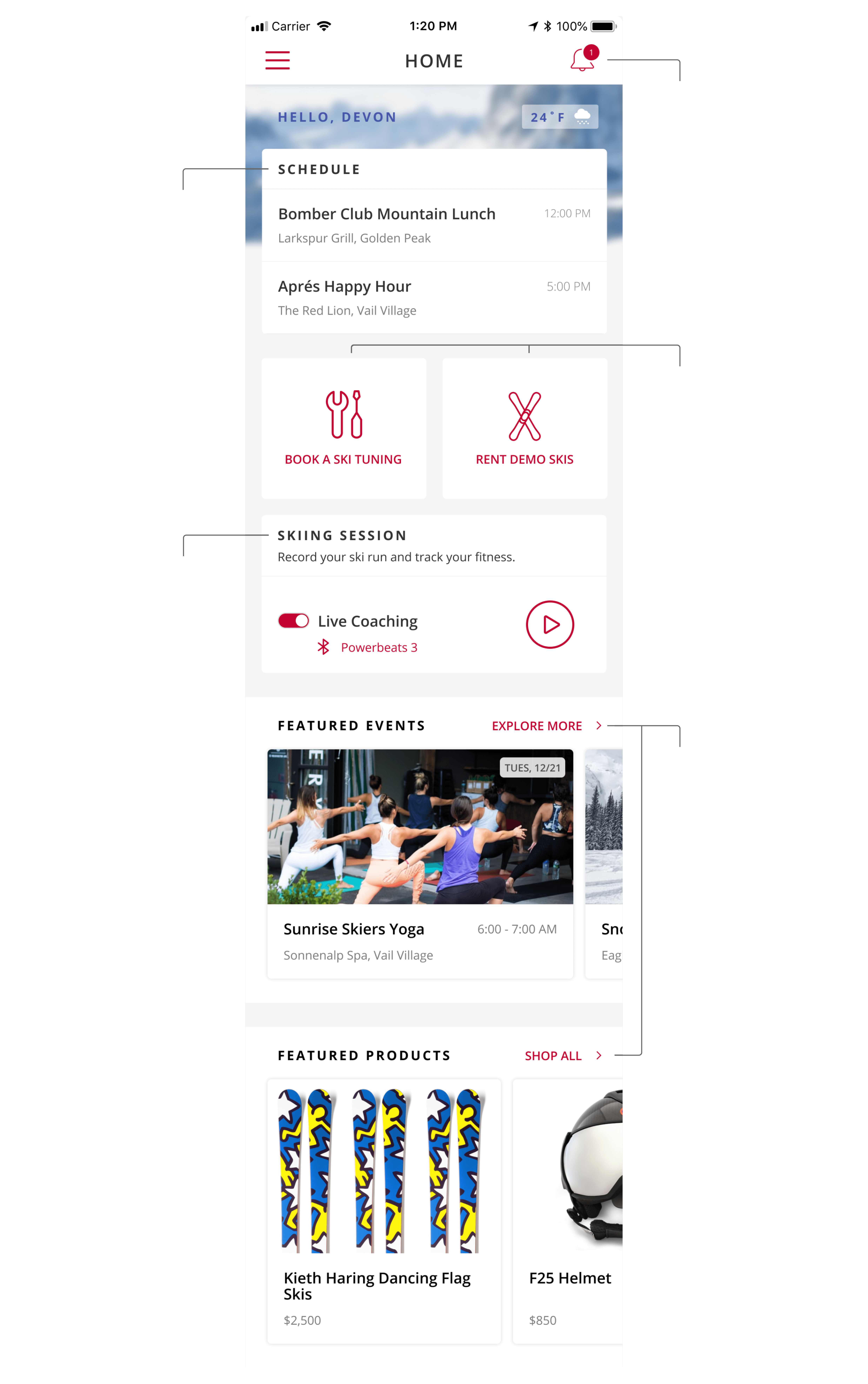
I ranked features by user urgency, frequency of use, and business value, taking into account context of use, existing persona research, and SME opinions:
Layout approach
With our priorities set, the next step was to translate them into a clear visual hierarchy. I designed layouts that made the most important actions easily accessible, especially in a ski environment. For example, the start button for workouts was placed within easy thumb reach on the home screen so users could start sessions quickly, even with cold hands or gloves on.
A focus on fitness
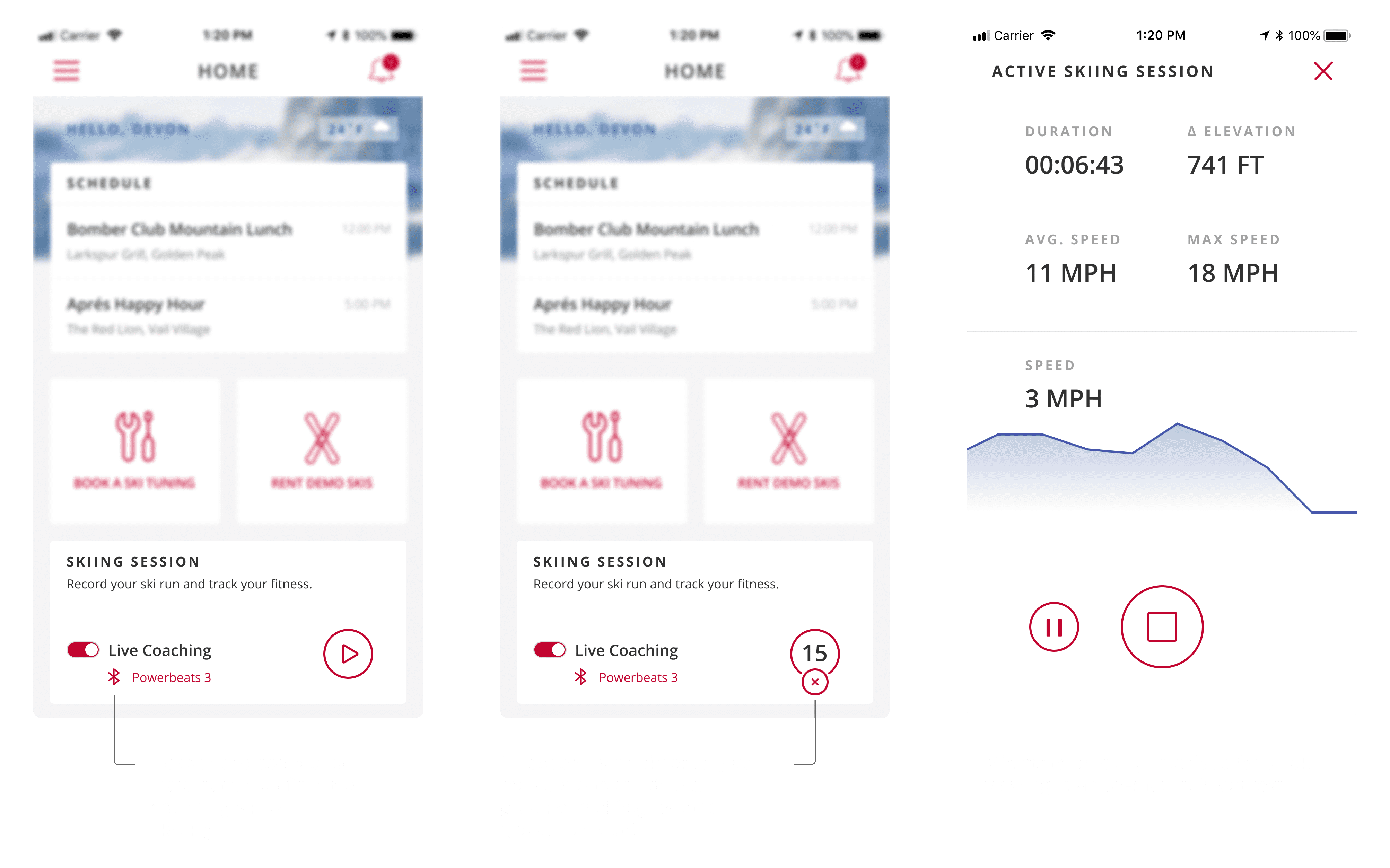
Fitness was a core part of the experience, but designing for snowy, outdoor conditions meant rethinking typical UX patterns. I designed a 15-second countdown before workouts began, giving users time to start the session, put gloves back on, and adjust their goggles — small details that made the app feel built for real skiers, not just gym-goers.
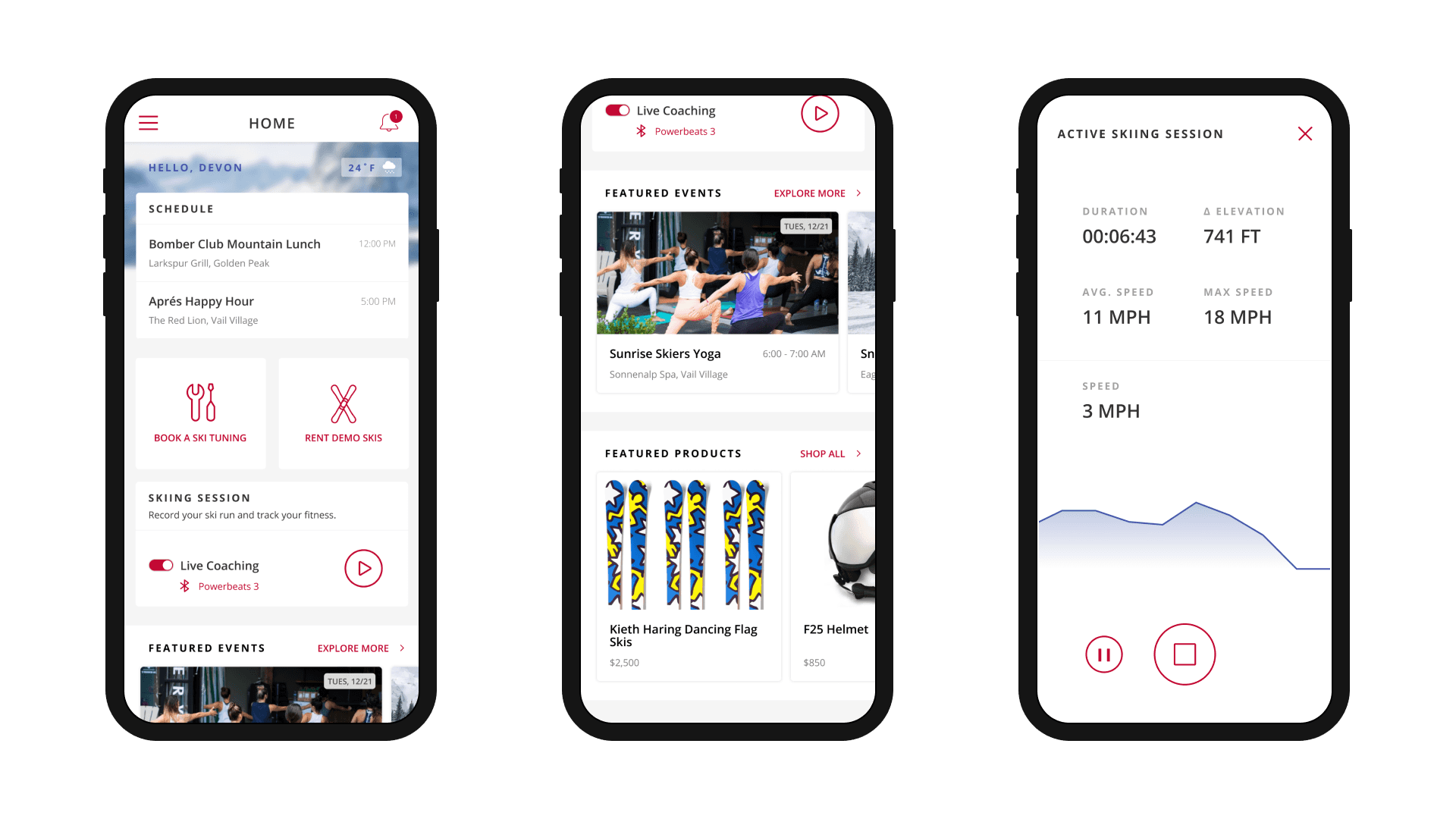
Final designs
Conclusion
Unfortunately, the company lost funding for the project before they could launch. Ideally, I would have run usability tests to see if our users could access our core features in-context of need: on the mountain, in the lodge, and at home. Post-launch, I would have looked at:
Did we get the layout correct? — Use a heat map to see if any features lower on the visual hierarchy are getting more activity than ones higher up, suggesting a reordering.
Did we skip any fitness steps? — Conduct on-mountain usability tests of the fitness features to see if there are any pain points we missed. In freezing temperatures, any hangups have large consequences.
This project reminded me that context is everything: design decisions have to work in the real world, not just in Figma. Prioritizing based on user behavior and business goals kept the experience focused, while small UX touches built for the environment created a genuinely skier-friendly product.


